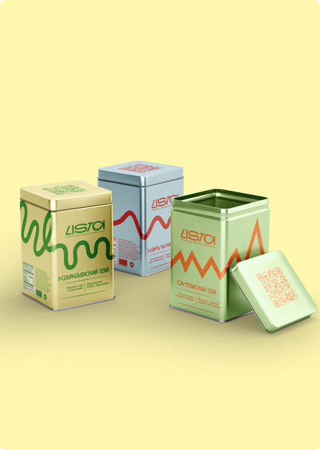
Contents:
I. How Communication Theory Works in Design II. LISTA for a General Audience III. LISTA for a Professional Audience IV. How Communication Theory Shapes Professional Strategy V. Bibliography and Image Sourses

I. How Communication Theory Works in Design
In our everyday life we see design as visual — posters, packaging, logos. But in this project, we treat design primarily as communication. A label, a video, or a social media post sends a message and shapes how people understand a brand. Communication theory explains why some visuals work and others fail. It reveals how media influence perception, how people interpret images, and how design persuades or engages an audience.
Media Ecology — The Medium is the Message
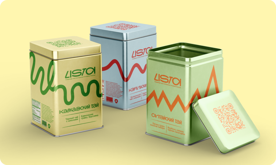
Marshall McLuhan argued that the medium itself communicates the message, independent of content. A billboard, a phone screen, and a physical object convey the same idea differently. In herbal tea brand LISTA, we chose a reusable metal container as our primary medium. Before the consumer reads any text, the material communicates: permanence, premium quality, tactility, sustainability. The embossed line design engages touch — a sense that paper packaging cannot activate. The container is also a «cool» medium in McLuhan’s sense: it requires active engagement. The consumer holds it, feels the embossed line, scans the QR code, and watches video. This progression of sensory experience is more memorable than text alone.
Framing Theory — Color and Form Direct Interpretation
Framing theory states that the way information is presented shapes interpretation, independent of facts. In design, frames operate through color, composition, and visual structure. Each region in LISTA uses a distinct frame. These frames work before conscious reading. They prime emotional response.
Narrative Paradigm — People Believe Stories
The narrative paradigm shows that people process information through stories, asking: «Does this feel true to me?» and «Does this match my values?» The drone video accessed via QR code tells a narrative: establishment of landscape → development through terrain → arrival at the tea source. This structure is coherent (logically constructed) and faithful (real footage of real places). Crucially, the embossed line on the container mirrors the video narrative. Altai’s ascending line echoes upward camera movement. This visual-tactile repetition anchors the story across multiple experiences.
Symbolic Convergence — Shared Symbols Build Community
Ernest Bormann argued that shared symbols create group consciousness. The map of Russia on visuals functions as a symbolic anchor, not a functional one. When a consumer sees this map, they unconsciously think: «This is part of a larger journey. I’m part of a group exploring Russian regions.» This symbol enables fantasy chaining: when one person’s story about the brand triggers others to create related stories, forming shared group identity.
Uses and Gratifications — Understanding Active Audiences
The reusable metal container satisfies multiple simultaneous needs: • Information (authentic origin) • Aesthetic (beautiful object to own) • Identity (signals eco-consciousness and cultural sophistication) • Social (shareable on platforms, gifts for travelers) • Ritual (transforms daily brewing into ceremony) Unlike disposable packaging (gratification ends immediately), the reusable container provides repeated gratification across all dimensions with every use.
Digital Rhetoric — Visual Persuasion
On social platforms, designers function as modern rhetoricians. We build visual arguments through brief, memorable imagery designed for sharing. LISTA’s strong color contrasts and embossed line designs work as asset — instantly recognizable and emotionally resonant.
These five theories form the foundation of LISTA’s design system. Rather than treating them as abstract concepts, we embed them directly into the physical medium, the visual language, and the communication strategy. The result is a complete communication experience where every element: material, color, form, symbol, and digital extension — works in concert to transmit meaning and build community.
II. LISTA for a General Audience
LISTA is a herbal tea brand that celebrates three Russian regions and everyday exploration. Each container represents one region landscape through a short drone film accessed via QR code. Our mission is simple: turn a regular cup of tea into a small journey. When you brew LISTA, you don’t just drink tea — you travel through Altai mountains, wind through Caucasus valleys, or navigate Karelia forests. LISTA stands for the joy of discovery, authentic connection to place, honest simplicity, and love for regional Russian culture. The brand addresses educated urban adults aged 25–45 who value design and illustration, love travel and nature, enjoy meaningful gifts, and share beautiful objects on social media.
Altai — Mountain Energy
The Altai region is framed as energetic and challenging. The embossed angular line, ascending at sharp angles, resembles mountain peaks and the physical act of climbing — much like the tea’s vigorous, crystalline character. The warm orange (FE8C41) and pale green background (D5F8BE) evoke high altitude and bright alpine light, conveying urgency and openness. The line itself seems to move upward, pulling the eye toward brightness and elevation. The drone film establishes this visual metaphor through movement. The camera rises through mountain passes, revealing the sheer scale and solitude of alpine terrain, the wild tea plants growing in meadows where cultivation is nearly impossible. The tea itself reinforces this frame. The flavor is sharp, like the air at altitude. It tastes clean, demanding presence and attention. This is not an easy, comfortable tea — it is a tea that asks something of you.
Caucasus — Warmth and Movement
Caucasus is framed as warm, generous, and inviting. The embossed serpentine line flows horizontally in multiple curves, resembling a winding mountain road that moves through valleys rather than climbing them. The warm green (51A81B) and gentle yellow (FFF6AF) suggest comfort, light, and hospitality — the visual opposite of Altai’s severity. The line moves gently and playfully, inviting travel rather than demanding it. The drone film follows this serpentine path, winding through terraced plantations and sunlit valleys. The camera moves with ease and rhythm, revealing layers of landscape: the places where Russian tea cultivation began in 1901, in regions rich with subtropical sun and dark earth. The movement is measured and warm, never urgent. You feel welcomed into these landscapes, not tested by them. The tea here is the most generous Russia produces. The flavor is full, complex, deeply satisfying: it tastes like warmth and generosity. This is a tea that offers comfort and connection. It invites slowness and conversation
Karelia — Northern Clarity



