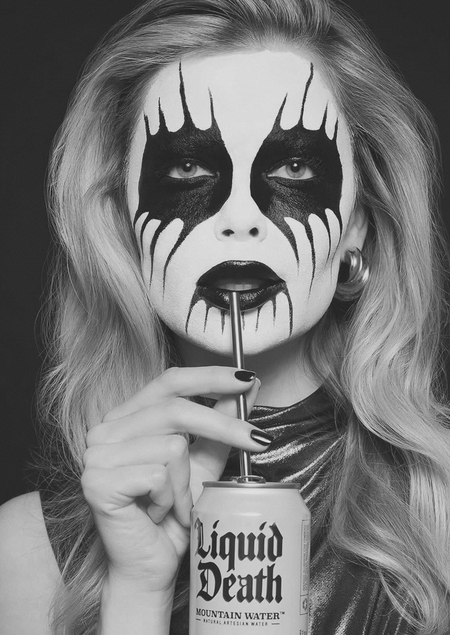
The aim of this study is to examine how Liquid Death uses visual codes, provocative rhetoric, dark humor, and mediated brand practices to transform ordinary drinking water into a culturally meaningful symbol of rebellion, health, environmental concern, and subcultural belonging.
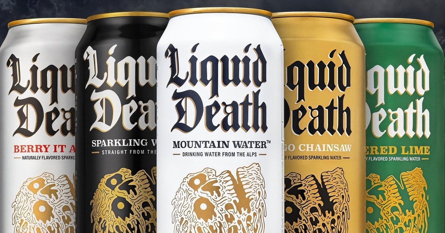
Selected communication theories and justification for their selection
The Semiotic Tradition is the strongest theoretical fit because Liquid Death’s communication strategy is built around signs and symbols. The brand does not merely inform audiences that it sells water; it re-codes the product through skulls, gothic typography, horror imagery, parody, pseudo-legal contracts, anti-plastic slogans, and the visual resemblance between its cans and beer packaging. In this case, communication is not a neutral transfer of information but a process of meaning creation through symbolic exchange. The brand’s central achievement is semiotic: it changes what water can signify.
The Elaboration Likelihood Model (ELM) helps explain why Liquid Death’s communication strategy is effective. Since bottled water is a low-involvement product, consumers are unlikely to spend much time evaluating its functional benefits. For this reason, Liquid Death relies heavily on the peripheral route of persuasion, using humor, shock value, celebrity endorsements, and unconventional imagery to capture attention and create memorable brand associations. At the same time, the brand supports these messages with central-route arguments related to hydration, low sugar content, and environmental care. By combining both routes of persuasion, Liquid Death increases audience engagement and brand recall, even when consumers do not carefully process product-related information.
Introduction
Liquid Death is an existing beverage brand that provides an unusually productive case for Communication Studies because it demonstrates how a familiar product category can be transformed through symbolic communication. In the conventional bottled-water market, brands such as Evian or Voss usually rely on visual codes of purity, transparency, nature, minimalism, wellness, and quiet luxury. Liquid Death deliberately rejects this dominant language. Its aluminum cans, gothic logo, skull imagery, and slogan «Murder Your Thirst» encode drinking water as something aggressive, ironic, subcultural, and anti-corporate rather than clean, gentle, and neutral.
The original idea behind the brand emerged from founder Mike Cessario’s observation that bottled water often does not fit the visual and cultural norms of environments such as rock concerts, music festivals, and other alternative subcultures. In these settings, products such as beer or energy drinks can function as symbols of group membership and lifestyle, whereas traditional bottled water is rarely associated with the same identity meanings. Liquid Death addresses this communicative gap by packaging water in tall aluminum cans and adopting the visual language of beer, punk rock, and heavy metal culture. As a result, the product serves not only a functional purpose by providing hydration, but also a symbolic one by allowing consumers to express an identity that aligns with the social environment.
From a communication-theory perspective, Liquid Death is not simply a company that sells water in cans. It is a sender that encodes meanings into verbal and non-verbal signs and distributes them through multiple channels: packaging, product names, advertising, website design, social media videos, loyalty mechanics, merchandise, celebrity collaborations, and environmental campaigns. The audience does not passively receive these messages. Consumers decode them through cultural contexts: rock music, internet humor, horror aesthetics, anti-consumerist irony, skepticism toward polished corporate wellness language, and concern about plastic pollution. The brand’s communication therefore operates as a negotiated process of meaning creation rather than a one-directional transmission of information.
The importance of this case lies in the tension between content and form. The content is ordinary and even healthy: water, flavored sparkling water, electrolytes, and low-sugar beverages. The form is violent, comic, grotesque, and intentionally excessive. This incongruity produces cognitive dissonance and visual shock. A can that appears to belong to beer or a dangerous energy drink contains water. A health-oriented message is delivered through the language of death, murder, zombies, fake doctors, clowns, and trash-filled sea animals. The brand captures attention because the receiver has to resolve the contradiction between what is shown and what is being sold.
The aim of this study is to examine how Liquid Death challenges conventional perceptions of bottled water through its distinctive communication strategy. Drawing on theories of visual perception, semiotics, and persuasive communication, the paper explores how the brand uses humor, shock, subcultural symbolism, and deliberate incongruity to construct a unique brand identity and create emotional connections with audiences. The analysis focuses on the broader communication ecosystem of Liquid Death, including its packaging, advertising campaigns, loyalty programs, environmental initiatives, and digital content, in order to understand how the brand transforms water from a functional product into a cultural and symbolic object.
Communication Channels
Liquid Death’s communication strategy is highly consistent across different channels. Rather than treating packaging, advertising, social media, public relations, and the website as separate elements, the brand uses all of them to reinforce the same core themes: death, rebellion, irony, environmental activism, and anti-corporate humor. This consistency helps create a strong brand identity and ensures that consumers encounter the same symbolic messages at every point of contact.
Packaging is one of the brand’s most important communication tools. More than simply containing the product, the can communicates a particular identity and set of values. Through its aluminum format, skull imagery, gothic typography, and aggressive slogans, Liquid Death deliberately contrasts with the clean and minimalist aesthetic typically associated with bottled water. By adopting visual codes commonly linked to beer, energy drinks, and alternative music culture, the brand makes water feel more compatible with environments such as concerts, festivals, bars, and other subcultural spaces.
The website extends this communication strategy. Instead of functioning solely as a platform for product information, it serves as an entertainment space that reflects the brand’s personality. For example, the Timewaster 5000 section collects advertising videos and presents them as content designed to entertain rather than sell. This approach strengthens the relationship between the brand and its audience by creating a sense of shared humor and cultural understanding. As a result, consumers are encouraged to see Liquid Death not only as a product but also as a brand that reflects their values and identity.
the «Timewaster 5000» page on the Liquid Death website
Product naming is another channel of symbolic exchange. Liquid Death’s flavored sparkling waters are positioned as «soda killers, ” and the names parody familiar soft-drink codes while preserving the brand’s death aesthetic. Names such as Dr. Death, Killer Cola, and Squeezed to Death do not merely identify flavors. They perform rhetorical work by mocking the conventions of Coca-Cola, Dr Pepper, and the wider soft-drink category. The result is a form of communicative mimicry: the product appears to speak the language of soda while simultaneously ridiculing it. This helps the brand occupy a position between health beverage and junk-food entertainment.
Advertising and PR are perhaps the most visible parts of the ecosystem. Liquid Death consistently uses dark humor, shock, and taboo-breaking to make public communication shareable. Campaigns about dehydration, hangovers, „Death Dust“ electrolytes, fake sleep aids, sugar consumption, plastic pollution, pregnancy hydration, and hostile internet comments all use absurdity to create attention and audience engagement. The brand’s advertising is not polite, neutral, or universally agreeable. It is designed to be interpreted, discussed, shared, criticized, and defended. In this sense, controversy is not an accidental by-product of communication but part of the communicative mechanism.
The «Sell Your Soul» or Liquid Death Country Club mechanism extends brand communication into loyalty and membership. Instead of using the conventional language of friendship, premium status, or customer appreciation, the brand invites consumers to «sell» their souls through a contract-like interface. This is a parody of the loyalty-program form itself. Most brands present data collection as care, personalization, or special access. Liquid Death exposes the transactional nature of this relationship by making it comic and demonic. The user gives data and attention; the brand gives merchandise, access, and status. The humor works because it says openly what many corporate loyalty systems hide under smoother language.
Although the current version of the Liquid Death Country Club no longer uses the «Sell Your Soul» interface and is temporarily closed to new members, the earlier format remains significant as an example of the brand’s communication strategy. The concept illustrates how Liquid Death transformed a conventional loyalty program into a parody of the consumer–brand exchange relationship.
Environmental communication is organized around #DeathToPlastic. The brand attacks plastic bottles and positions aluminum cans as a more responsible alternative. Importantly, this environmental discourse does not use the soft, moralizing, green visual language common in corporate social responsibility campaigns. Instead, Liquid Death shames plastic producers, mocks them, and uses horror-comedy imagery to communicate ecological consequences. This is especially visible in «Cutie Polluties, ” a campaign built around plush ocean animals mutilated by plastic waste. The campaign combines the childish codes of toy advertising with violence and environmental disaster. The collision between cuteness and horror makes the message emotionally difficult to ignore.
Social media and video platforms operate as distribution channels for the brand’s mediated communication. Liquid Death’s videos often function less like conventional ads and more like short-form entertainment designed for circulation. The brand understands that contemporary audiences often use media for amusement, social sharing, identity signaling, and community participation. A person who shares a Liquid Death video is not only spreading product information; they are also communicating something about their own humor, taste, and cultural position.
Audience interaction is also part of the brand’s communication strategy. The campaign «I’d Never Drink Some Sh*t Called Liquid Death, ” performed with country singer Carter Faith, transforms negative internet comments into entertainment. This move is important for public relations because the brand refuses the conventional customer-service posture of apologizing, softening, and trying to please everyone. Instead, it incorporates criticism into the brand narrative. The dissatisfied audience becomes raw material for content, while loyal consumers are invited to enjoy the brand’s refusal to be domesticated.
Theoretical Framework
The first theoretical lens used in this paper is the Semiotic Tradition. This approach views communication as the creation and interpretation of meaning through signs. Words, images, colors, symbols, and design elements do not have fixed meanings on their own; they acquire meaning through cultural and social contexts. For example, a skull, a gothic typeface, an aluminum can, or a plastic bottle can evoke very different associations depending on how and where they are used.
The Semiotic Tradition is particularly relevant to Liquid Death because the brand relies on changing the conventional meaning of bottled water. In most cases, water is associated with purity, health, nature, and wellness. Liquid Death challenges these associations by combining water with visual and verbal elements drawn from punk culture, heavy metal aesthetics, dark humor, and anti-corporate attitudes. As a result, the product is presented not only as a healthy beverage but also as a symbol of rebellion, individuality, and cultural belonging.
This perspective also highlights the importance of context in shaping meaning. A traditional plastic water bottle may fit naturally in a gym or health-oriented environment, while Liquid Death’s packaging is designed to feel more at home in spaces such as concerts, festivals, bars, and alternative subcultures. By borrowing visual codes commonly associated with beer and energy drinks, the brand makes water appear compatible with social settings where it might otherwise seem out of place. In this way, Liquid Death demonstrates how meaning is not inherent in a product itself but is constructed through communication and cultural interpretation.


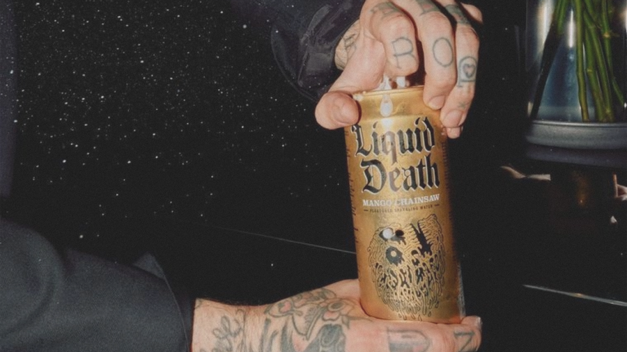
Liquid Death campaign with Travis Barker
The second theoretical lens used in this project is the Elaboration Likelihood Model (ELM), developed by Richard Petty and John Cacioppo. The model explains how persuasive communication can influence attitudes through two routes of processing. The central route relies on the evaluation of information and arguments, while the peripheral route depends on cues such as emotions, humor, visual appeal, source credibility, and social identity. In practice, many successful campaigns combine both routes.
The Elaboration Likelihood Model is particularly useful for understanding Liquid Death’s communication strategy. The brand promotes rational product benefits, including hydration, lower sugar content than many soft drinks, reduced plastic use, and recyclable aluminum packaging. However, these messages are rarely presented in a traditional informational format. Instead, they are embedded within humorous, provocative, and highly entertaining campaigns that use shock, parody, celebrity appearances, and unconventional storytelling to attract attention. As a result, consumers may first engage with the entertainment value of the message and only later process the underlying product benefits. This combination of central and peripheral appeals helps explain how Liquid Death generates both high visibility and strong audience engagement.
The model also helps explain why Liquid Death is effective among audiences that are skeptical of ordinary advertising. Direct moral persuasion often fails with audiences who resist being told to drink more water, consume less sugar, or care about ecology. Liquid Death reduces this resistance by presenting persuasive messages as jokes, performances, or cultural artifacts. The audience is entertained before it is instructed. This makes the message less likely to be decoded as boring corporate responsibility or traditional wellness advertising.
Analysis
Liquid Death’s brand communication begins with category disruption. In the bottled-water category, the expected signs are transparent packaging, blue or green color palettes, mountains, springs, clean typography, and references to purity or health. Liquid Death disrupts this code by replacing the conventional language of purity and wellness with a visual and symbolic language more commonly associated with rebellion, risk, and counterculture.
Rather than presenting water as a healthy necessity, the brand frames it as an attitude-driven product, transforming the meaning of bottled water through an unexpected set of cultural associations. The phrase «Murder Your Thirst» is an especially important example of verbal encoding. A traditional water brand might promise refreshment, purity, balance, or natural hydration. Liquid Death uses the violent verb «murder, ” producing an immediate semantic contradiction. The object of violence is not a person but thirst, which makes the slogan comic rather than literally threatening. The audience decodes the phrase as exaggerated, performative aggression. The brand thereby creates a rhetorical identity: it is a water brand that refuses to speak like a water brand.
Liquid Death Main page
The packaging also functions as identity construction. For the target audience of rockers, punks, festival-goers, and people who identify with alternative culture, the can permits a different form of self-presentation. Carrying the product can communicate belonging to a cultural group, rejection of mainstream wellness aesthetics, or participation in a joke. The product becomes a communicative accessory. It allows the consumer to drink water without performing the visual identity of the «responsible» health consumer. This is central to the brand’s social meaning.
The founder’s own explanation reinforces this reading. Cessario frames the brand as a combination of alternative culture, music, art, comedy, health, and a desire to push the boundaries of marketing and advertising. This statement matters because it clarifies the intended encoding of the brand. Liquid Death is not trying to make water more elegant; it is trying to make healthy beverages communicate with the same irreverent energy as alcohol, junk food, comedy, and subcultural media.
From a semiotic perspective, Liquid Death extends its brand identity across product categories by maintaining a consistent symbolic logic. Rather than introducing flavored sparkling drinks through conventional taste, refreshment, or lifestyle appeals, the brand presents them as playful alternatives to traditional soft drinks. Product names such as Dr. Death and Killer Cola transform familiar category references into parody, allowing the brand to participate in soda culture while simultaneously distancing itself from it. As a result, the products function not only as beverages but also as expressions of the brand’s broader anti-conventional identity.
A similar logic appears in the marketing of Death Dust, the company’s electrolyte product. Instead of promoting an idealized vision of health and self-discipline, the campaign focuses on ordinary imperfections and everyday excesses. Its advertising depicts exaggerated characters suffering from dehydration after common situations, turning a functional health problem into a source of humor. This approach positions the brand closer to the realities of audience behavior rather than to aspirational wellness ideals. By acknowledging experiences that many consumers recognize but that health-focused brands often ignore, Liquid Death creates a communication style that feels more relatable and less judgmental.



