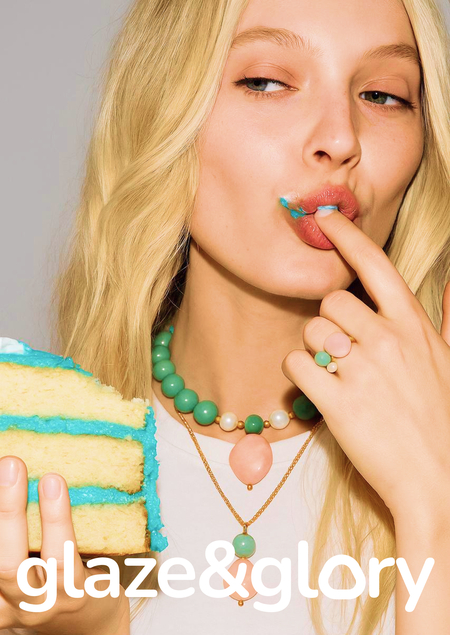

Brand uses communication theory to build meaning through symbols and signs. Jewelry is presented as a thing that visually merges with dessert forms and aligns brand with a semiotic tradition. The message is understood quickly through sensory signs: textures, glossiness.
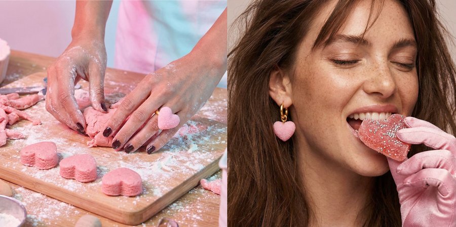
In design, communication theory helps explain how objects can speak through form, color, and material long before any text appears. Designers often work with visual rhetoric, arranging elements and choosing colors in ways that guide perception and emotion. Meaning is also created through signs, as the semiotic tradition suggests, because viewers read shapes and textures as symbolic cues that connect to their own experiences.
These ideas become especially visible in glaze & glory, where jewelry is intentionally crafted to trigger associations with sweets. The soft, glossy surfaces act as peripheral cues in the Elaboration Likelihood Model: people respond emotionally first, without cognitive effort. By relying on intuitive, sensory communication rather than detailed explanation, the brand shows how design can function as a persuasive message. It demonstrates that in contemporary design practice, communication is not only about storytelling in words, but about shaping experiences that allow audiences to «read» the object through feeling and memory.

What is glaze & glory? glaze & glory is a jewelry brand inspired by the aesthetics and sensations of sweets. Not literal replicas, but carefully translated forms, textures, and colors that evoke sugar, candy, and small childhood pleasures.

These are pieces that look as if they could be tasted soft shapes, glossy surfaces, pastel tones transforming edible memories into wearable objects.
The brand materializes nostalgia, turning the feeling of sweetness into a visual and tactile experience. glaze & glory exists at the intersection of emotion, memory, and design where jewelry becomes a reminder that joy can remain light, playful, and intimate even in adulthood.
Key visual The key visual language is built around jewelry that resembles sweets. Rings, earrings, and pendants visually echo candy shapes: gummy hearts, sugar-coated surfaces, lollipops, and jelly textures. Materials appear glossy, translucent, and softly reflective, creating the illusion of edible objects while remaining clearly precious.
Visual accents reference candy packaging, playful doodles, and gentle movement, reinforcing the feeling of lightness and desire. The result is a visual system that feels: sweet but refined, playful yet intentional, nostalgic without being childish.
Target audience and key message Target audience: Girls and women aged 15–35 who are emotionally driven, visually sensitive, and value personal meaning in objects. They appreciate design with character, enjoy nostalgia, and often choose jewelry as an emotional purchase for themselves or as a gift.
Key message: «Jewelry with the taste of childhood.» Communication goal: To shift the perception of jewelry from a decorative accessory to an emotional object one that carries memories, sensations, and personal associations.
Theoretical framework: how we communicate The brand communicates primarily through the peripheral route of the Elaboration Likelihood Model (ELM), addressing emotions rather than rational arguments.
Instead of focusing on materials or technical characteristics, communication relies on: Sensory appeal: sugar-like textures, glossy finishes, candy-inspired colors. Emotional cues: nostalgia, warmth, and playful pleasure. Associative thinking: visual resemblance to sweets triggers memory and desire instantly.
The jewelry is understood intuitively through feeling before thought.
Brand values and community glaze & glory is built on three core values: 1. Nostalgia Each piece recalls small, happy moments, candies bought on the way home, shared sweets, unexpected treats. 2. Playfulness The brand embraces softness, joy, and visual humor as a conscious aesthetic choice. 3. Emotional connection Jewelry becomes personal: not just worn, but remembered, gifted, and emotionally owned. Together, these values create a brand that people relate to, not just consume.
Promotion strategy and engagement mechanics Communication channels: 1. Website The central brand space where storytelling, collections, and visual identity come together. The site works as an immersive environment rather than a traditional catalog.
2. Social media (Telegram, TikTok) Used for visual storytelling, emotional mood-building, behind-the-scenes content, and short-form video.
3. Marketplaces and Gold Apple Jewelry is available on selected marketplaces, ensuring accessibility and ease of purchase while maintaining strong visual branding.
Offline activation: pop-up experience The brand extends beyond digital platforms through pop-up stores. Pop-ups are designed as playful, candy-inspired spaces where jewelry is displayed like sweets in a store window. Visitors interact with the brand physically, reinforcing the tactile and emotional nature of the products.
As part of offline promotion, the brand distributes real sweets on the street, packaged in signature branded bags. This gesture works as a direct sensory trigger taste and touch inviting people into the brand’s world before they even see the jewelry.
The experience creates instant emotional engagement and transforms first contact into a memorable moment.



