Сommunication theory in the field of design
Communication can be understood as the process of producing meaning through the exchange of symbols within specific social and cultural contexts. By its nature, it is relational, symbolic, and situational: the meaning of a message is not fixed but is shaped depending on the conditions in which it is presented—whether in an exhibition space, a digital social media environment, or private interpersonal correspondence.
Communication theory serves as a structured framework for understanding this dynamic. It translates intuitive comprehension of communicative processes into a set of conceptual models that describe, explain, and, in some cases, transform the ways communication functions. This is particularly evident in design and contemporary art, where every visual object—from a poster to an installation or everyday artifact—operates simultaneously as a utilitarian object and as a carrier of theoretical commentary on identity, power, and culture.
In general, communication theories can be approached from two complementary perspectives.
Objective theories focus on identifying stable and measurable patterns in communication, such as behavioral effects, cognitive responses, or audience influence. These theories primarily rely on quantitative methods and empirical research.
Interpretive theories, by contrast, emphasize the meanings, values, and multiple realities constructed through communication. They employ qualitative methods, close reading of texts, and analysis of cultural practices, highlighting the contextual and often ambiguous nature of meaning.
A useful analytical framework in this context is Robert Craig’s meta-theoretical system of seven traditions of communication, which includes the cybernetic, socio-psychological, sociocultural, critical, rhetorical, phenomenological, and semiotic approaches. Each tradition provides a distinct lens for understanding communication and allows the same object to be examined from multiple theoretical perspectives.
In relation to design and art, this means that any object can be understood simultaneously as a semiotic system of signs and visual codes, as a sociocultural practice shaping identity, as a critical discourse that reinforces or questions existing norms, and as a means of interpersonal communication that shapes modes of interaction, self-presentation, and social perception.

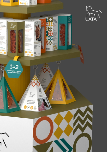
UATA — A Brand of Functional Treats for Horses
Within the framework of Robert Craig’s seven traditions of communication theory, the UATA brand can be understood as:
• a semiotic system in which naturalness and safety operate as visual and material signs of trust; • a sociocultural practice that shapes a culture of careful, conscious interaction with animals; • a means of interpersonal communication that supports dialogue between human and horse throughout training and care.
Thus, UATA is not merely a brand of functional treats, but a communicative mediator that, through taste, composition, and the act of reward, conveys values of respect, care, and long-term health—transforming training into a meaningful and ethical interaction.
Presentation for a general audience
UATA is a brand of natural treats for horses, offering a wide range of flavors that are safe for both animals and humans. Our slogan: «Share the joy: UATA treats — the taste of care for you and your horse.»
Positioning UATA creates a unique category of treats — a premium product for modern horse owners who pay close attention to their horse’s health and emotional well-being.
Relevance for Owners A UATA treat helps owners express their attitude toward their horse: it is a sign of care and trust. By giving a treat, the owner is literally communicating, «I care about you, ” strengthening the emotional bond.
Functional and Emotional Needs Placing a treat into a horse’s hand satisfies not only practical needs (a healthy reward) but also identity-driven ones: owners feel proud to choose a high-quality, natural product.
Core Problem and Its Solution Previously, horse treat packaging often looked cheap and childish, lacking clear positioning. UATA solves this problem: our design is minimalistic, mature, and stylish, with product benefits clearly stated. Owners now have no doubts about safety and value — everything is presented transparently and honestly.
Example of Communication Giving a UATA treat is a symbolic gesture. The owner tells the horse: «You are special, and I invest in the best for you.» The horse’s reaction (joy, trust) and praise from others become feedback within this interaction.
Social Exchange According to social exchange theory, UATA’s value lies in its high reward-to-cost ratio.
Rewards: • Strengthened trust from the horse • Emotional joy from the horse’s satisfaction • A variety of flavors for new experiences • Pride in caring for the horse’s health
Costs: •Financial spending on high-quality treats • Time spent on training or rewarding
The brand emphasizes that all «costs» are justified: a horse’s health and happiness are priceless. We assure owners that investing in UATA treats is an investment in a strong bond and shared pleasure that far outweigh the money and effort spent.
Presentation for a professional audience
Concept and Form UATA treats are designed as a bridge between humans and horses. Their visual language combines tradition and modernity: Tradition: classic motifs — carrot, apple, horseshoe — familiar and emotionally close to every horse owner. Modernity: minimal, clear graphics and concise packaging emphasize naturalness and premium quality.
On a semantic level, each UATA treat functions as a sign of care. Traditionally, giving a horse a treat symbolizes reward and affection. UATA re-encodes this sign through contemporary design.
Formally, the packaging is an eco-friendly pouch with a transparent window, allowing the natural content to be seen immediately. Different flavors are marked with a unique color accent and a pictogram of the corresponding ingredient (carrot, apple, beetroot, mint, etc.).
Color Palette The color selection reflects naturalness and vitality: Green: symbolizes freshness, grass, and nature. Orange: associated with carrots — the classic horse treat — conveying warmth and energy. Red / Burgundy: evokes juicy apples and berries, draws attention, and expresses the owner’s passion for their horse. Beige or Brown: earthy, natural tones associated with safe, natural ingredients and an organic base.
Each product color carries a clear semiotic function: orange explicitly signals «carrot, ” red „apple/berries, ” and green „herbs/mint.“ Together, the palette immerses the buyer in the atmosphere of a stable and the natural world, combining nostalgia (traditional flavors) with a contemporary aesthetic.
From the perspective of critical communication theory, we deliberately play with expectations: a horse treat is rarely perceived as a stylish accessory, but rather as a rural, utilitarian object. UATA subverts this assumption through an ironic gesture — applying a rigorously designed, „serious“ visual sign system to a „simple“ product. This subtly challenges the idea that „horse-related products don’t require refinement“ and elevates interaction with the horse to the level of a conscious, meaningful practice.
Typography UATA’s typographic system combines two principles: A clean, geometric sans-serif typeface (for primary packaging text) emphasizes modernity and readability. A small handwritten or decorative typeface for the brand name and accents adds warmth and conveys individuality and care.
This pairing communicates a key idea: we rely on experience and sincerity (the handwritten, «human» type), while presenting everything within a modern, restrained visual system (simple sans-serif forms). It unites traditional values of care with a rational, quality-driven approach.



