The Role of Communication Theory in Design and Contemporary Art
Design is often treated as a discipline concerned with form, aesthetics, and usability. Communication theory offers a different perspective. It positions design as a practice of meaning-making, where visual and structural decision participates in how messages are encoded, transmitted, and interpreted. This shift from «how it looks» to «how it communicates» is particularly consequential in contemporary art, where meaning is never fixed and always depends on context itself.
Communication can be understood as a process of creating and interpreting meaning through symbolic exchange. This definition emphasizes that messages do not travel from sender to receiver intact. They are encoded using available cultural codes, and then decoded by audiences according to their own frameworks, experiences, and contexts. The gap between encoding and decoding is not a failure of communication but its fundamental condition.
In contemporary art, this understanding becomes more than essential. Artworks do not carry self-evident meanings. A work shown in a white-cube gallery communicates differently than the same work posted on social media. The medium, the interface, and the surrounding discourse all participate in shaping what the work means. Communication theory provides tools for analyzing these layers without collapsing them into simple formulas.
For a project like ARTOVOE, which operates as a digital media catalog for emerging artists, these considerations are not abstract. The platform must navigate between multiple communicative logics. Artists seek visibility without losing the complexity of their work. Audiences seek orientation without being told what to think. Institutions and algorithms impose their own criteria of relevance.
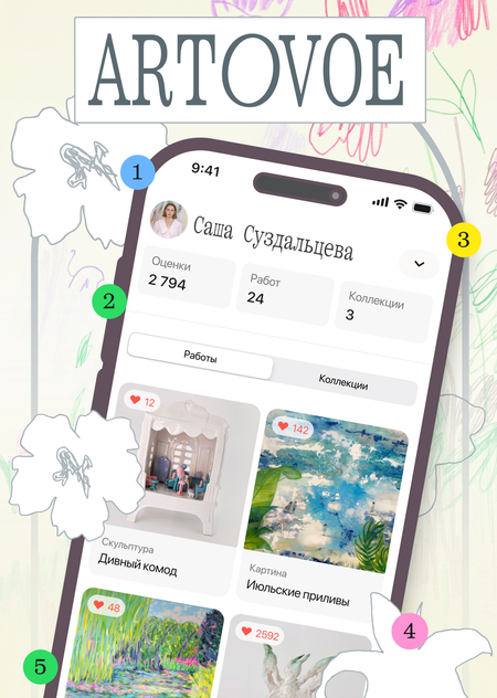
The semiotic tradition treats communication as the sharing of meaning through systems of signs. Signs are not limited to words. Colors, typefaces, layouts, navigation patterns, and even the absence of certain elements function as signs within cultural codes. A minimalist interface with generous white space signifies something different than a dense, information-heavy layout. The first suggests attentiveness, selectivity, perhaps exclusivity. The second suggests abundance, comprehensiveness, perhaps overwhelm. ARTOVOE’s visual identity operates within this semiotic logic. The clean white backgrounds, the distinctive typography, the restrained color palette encode a particular stance toward art and its presentation. The design signals that artworks deserve focused attention, that the platform values clarity over noise.
Rhetoric, understood as the art of persuasion, provides tools for analyzing how communication influences audiences. Classical rhetoric identifies three modes of appeal. Ethos concerns credibility and character. Pathos concerns emotional engagement. Logos concerns rational argument and evidence. Effective communication typically combines these appeals, but different contexts and audiences require different emphases. For ARTOVOE, rhetorical strategy must shift depending on who is being addressed. When communicating with a general audience of art enthusiasts and potential collectors, pathos takes priority. The goal is to spark curiosity, to create a sense of discovery, to make contemporary art feel approachable rather than intimidating.
The sociocultural tradition holds that meaning arises from shared practices and cultural contexts. It views communication as participation in the reproduction or transformation of social reality. In communicating, people use existing cultural codes and, in doing so, either reinforce or challenge them. ARTOVOE operates within the specific cultural practice of engaging with contemporary art. This practice is shaped by institutions, market forces, educational systems, and digital platforms.
The critical tradition, originating in the Frankfurt School, examines how communication relates to power, ideology, and social structures. It questions who controls communication, whose interests dominate, and how media systems affect inequality. For ARTOVOE, this necessitates examining its own position. Digital platforms act as powerful gatekeepers in the art world. Algorithms govern visibility. Metrics dictate success. Commercial pressures can push artists to prioritize engagement over integrity. A platform dedicated to emerging artists must consciously address these forces.
These four traditions do not form a single theory. Instead, they function as complementary analytical lenses. Semiotics examines the sign systems that encode meaning. Rhetoric investigates the strategies for audience engagement. Sociocultural theory studies the practices that shape social reality through communication. Critical theory analyzes the power relations framing all communication.
For ARTOVOE, integrating these perspectives requires a multidimensional approach to design. The visual system should convey the intended meaning. The language must effectively persuade its varied audiences. The platform’s architecture needs to foster practices consistent with its core values. Ultimately, its positioning must consciously address the power structures of the art world.
ARTOVOE for general audience
Have you ever discovered an artist too late?
You scroll through your feed, and suddenly there it is. A work that stops you. Something in the color, the gesture, the strangeness of it? You want to know more. Who made this? What else have they done? But the algorithm has already moved on, and the image dissolves into the endless stream. The artist remains a ghost, a fragment without context. This happens more often than it should.
Talented artists create extraordinary work, but the infrastructure of visibility fails them. Social media rewards frequency and trend-chasing. Galleries focus on established names. The space between «unknown» and «discovered» remains difficult to cross. ARTOVOE exists in that space.
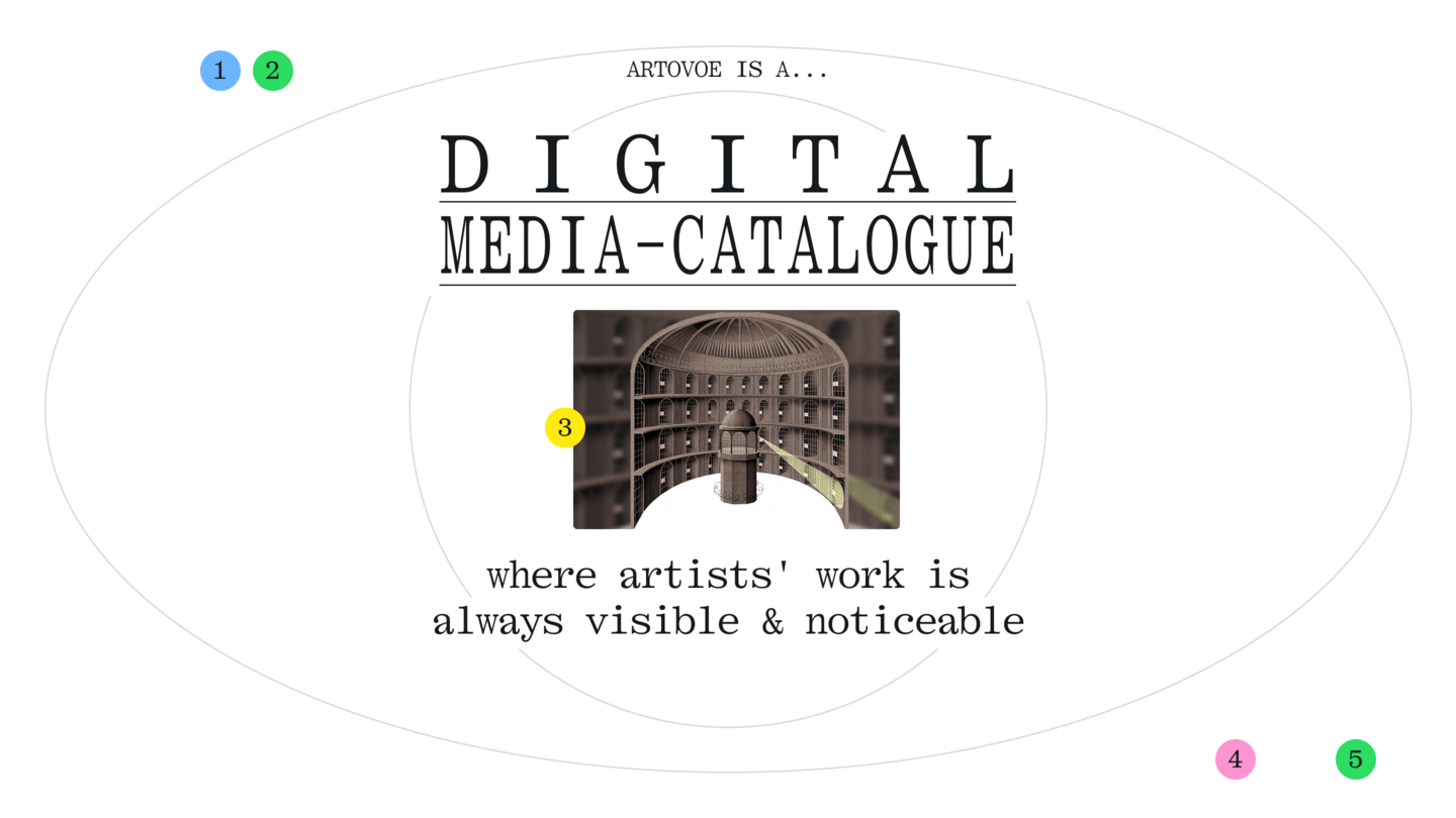
ARTOVOE is a digital media catalog for contemporary art, not a typical social media feed. Not a marketplace also. A catalog where artists can present their work with the context it deserves, and where viewers can discover it with the attention it requires. The tagline says it directly: a careful look at art. This is both an invitation and a stance. Careful looking takes time. It resists the logic of the scroll. It assumes that art rewards attention, that emerging artists have something to offer beyond the immediately viral, and that viewers are capable of more than passive consumption.
On our platform artists build profiles that hold together. Works are accompanied by statements. Exhibition histories are documented. Thematic collections provide entry points. The structure supports coherence rather than fragmentation.
What makes ARTOVOE different?
Most platforms treat art as consumer content. Units to be sorted, ranked, and served according to engagement metrics. ARTOVOE treats art as work that exists within trajectories, intentions, and contexts. The difference is structural, not just rhetorical. The design reflects this. Clean interfaces with generous space allow works to breathe. Typography and color accents create a recognizable identity without overwhelming what matters most — the art itself. The aesthetic is contemporary but not cold, accessible but not dumbed down.
The tone reflects this too. ARTOVOE communicates with a voice that is precise, lightly ironic, and energetic without being manic. Phrases like «a piece of art» or «aesthetic leak» signal a sensibility: serious about art, skeptical of pretension, open to play.
ARTOVOE welcomes anyone curious about contemporary art. You do not need credentials. You do not need to know the right names or the correct terminology. You need only a willingness to look, to stay a moment longer than the feed demands, to let something unfamiliar become interesting. If you are a collector looking for work that has not yet been absorbed by the market, ARTOVOE offers a space for discovery. If you are simply someone who wants art in your life without the gatekeeping, ARTOVOE offers a point of entry.
The artists on ARTOVOE are emerging, but emerging does not mean lesser. It means not yet fully visible within existing systems. The work is here. The attention is what has been missing.
ARTOVOE for a professional audience
The contemporary art ecosystem faces a structural challenge concerning emerging artists. Talent is abundant, but visibility is unevenly distributed. Established artists benefit from institutional support, gallery representation, and accumulated cultural capital. Emerging artists, by contrast, often depend on platforms whose logics work against sustained attention.Social media algorithms optimize for engagement metrics that favor frequency, trend alignment, and immediate visual impact. These criteria do not correlate with artistic quality or long-term significance.
An artist producing complex, slowly-developing work is structurally disadvantaged compared to one producing content optimized for the scroll. Meanwhile, professionals who seek emerging talent as curators, collectors and institutional representatives face discovery costs. ARTOVOE addresses this mismatch by applying catalog logic to the problem of visibility.
ARTOVOE functions as a media catalog, not a social feed. The distinction is fundamental. A feed presents content as a stream ordered by algorithmic relevance or chronological sequence. Each item competes for momentary attention. Context collapses into the single visible unit.
A catalog presents entries as structured records within a navigable system. Each entry is a coherent representation rather than a fragment. Context is preserved through relational organization. ARTOVOE’s catalog structure includes several integrated components. Artist profiles contain works, artist statements, exhibition histories, and contact information for professional inquiries. Thematic collections allow groupings that surface conceptual connections across artists. Search and discovery mechanisms support targeted exploration by medium, theme, or other parameters.
The visual identity of ARTOVOE communicates through deliberate semiotic choices. Minimalist layouts with substantial white space signal that artworks are the primary content, not competing with interface elements for attention. The restrained palette establishes a neutral ground that does not impose chromatic bias on diverse artistic styles. Distinctive typography and selective color accents create platform recognition without institutional coldness.
The tone of voice positions ARTOVOE between informal discovery spaces and formal art-world infrastructure. The language is precise but not bureaucratic, energetic but not promotional. This positioning is strategic: it signals accessibility to emerging artists who might be alienated by institutional formality, while maintaining credibility with professionals who require serious engagement.
Value proposition for professional stakeholders:
For curators and institutional representatives, ARTOVOE offers a discovery environment structured for professional evaluation. Coherent artist profiles reduce research friction. Documented histories provide verification. Direct contact channels enable efficient outreach.
For collectors, ARTOVOE provides access to emerging artists before market absorption. The catalog structure supports informed acquisition decisions based on artistic trajectories rather than isolated impressions.
For galleries and commercial representatives, ARTOVOE surfaces talent that might otherwise remain invisible within algorithmic systems.
For artists themselves, ARTOVOE offers professional representation infrastructure without gatekeeping barriers.
How communication theory shaped these Presentations
The two presentations above serve different audiences and employ different communicative strategies. These differences are not arbitrary. They emerge from a deliberate application of communication theory to the design of persuasive materials. Below, the theoretical frameworks that guided specific decisions are examined.
Communication theory emphasizes that messages are encoded by senders and decoded by receivers, and that these operations rarely coincide perfectly. Audiences bring different frameworks, expectations, and contexts to their interpretation of messages. Effective communication anticipates these decoding conditions and encodes accordingly. The two ARTOVOE presentations encode the same core identity but for different decoding conditions.
The same brand, the same values, the same platform but two different encodings for two different decoding environments.
The rhetorical tradition provides the concepts of ethos, pathos, and logos as modes of persuasive appeal. These modes can be combined in different proportions depending on audience and purpose. The general audience presentation prioritizes pathos. The opening hook creates emotional identification with a frustrating experience. The description of artists as «ghosts» and «fragments» evokes loss and missed connection. The invitation at the end appeals to desire for discovery. Throughout, the presentation seeks to generate feeling before argument.Ethos in the background through tone. The voice that emerges (precise, lightly ironic, genuinely enthusiastic) establishes a character that the audience can trust.
This is not institutional authority but personal credibility, the sense that the speaker actually cares about what they are describing
McLuhan’s insight that the medium shapes the message has implications for how presentations are formatted and delivered. The form of communication influences interpretation alongside its content. Both presentations are designed as text-based materials suitable for scrolling interfaces. This acknowledges contemporary reading conditions where attention is limited and skimming is common. Short paragraphs, clear section breaks, and bold text anchors allow readers to navigate efficiently.
However, the two presentations handle this constraint differently. The general presentation creates a relatively «cool» experience in McLuhan’s terms: lower density, more participatory, inviting the reader to project themselves into the narrative. White space is generous. The pacing allows breath. The reader is invited to imagine and feel rather than merely absorb.
Despite their differences, both presentations maintain semiotic consistency with ARTOVOE’s brand identity. Certain signifiers appear in both, encoding the same core values.
«A careful look at art» appears in both presentations. This phrase functions as a semiotic anchor, encoding the platform’s fundamental stance regardless of audience. The word «careful» does significant work: it opposes the careless scrolling of feeds, signals respect for art and viewer alike, and positions attention as an ethical practice.
The tension between accessibility and seriousness is encoded throughout both presentations. The general presentation achieves this through tone: playful without being frivolous, direct without being simplistic.
The visual logic of the platform is described consistently, though with different emphases. Both presentations reference minimalism, white space, and distinctive typography.
The sociocultural tradition emphasizes that communication participates in reproducing or transforming cultural practices. Both presentations position ARTOVOE as an intervention in existing practices of engaging with contemporary art.The general presentation frames ARTOVOE as an alternative to feed culture. The solution offered is explicitly structural: a catalog rather than a feed. This frames the user’s engagement with ARTOVOE as participation in a different practice, one of careful looking rather than passive scrolling.
The professional presentation frames ARTOVOE as an alternative to fragmented discovery. The solution is again structural: catalog logic that preserves context and supports evaluation. Both framings position adoption of ARTOVOE as a cultural choice, not merely a functional one. Users are not just accessing a service; they are participating in a practice with values.
The critical tradition’s attention to power, ideology, and institutional dynamics informed specific choices in both presentations.The general presentation avoids institutional voice. Art-world discourse often functions as a gatekeeping mechanism, using specialized vocabulary and assumed knowledge to signal insider status and exclude outsiders.
The professional presentation acknowledges structural critiques. The discussion of algorithmic platforms explicitly identifies their logics as problematic for artistic integrity. The positioning of ARTOVOE as resisting algorithmic ranking and preserving artistic complexity responds to critical concerns about platform capitalism in the art world.
Both presentations refuse promotional hyperbole.
Summary
Communication theory did not function as external decoration applied to completed presentations. It provided the framework within which presentations were conceived and developed. Encoding/decoding analysis determined how the same content would be presented differently for different audiences. Rhetorical theory guided the balance of persuasive appeals in each context. McLuhan’s media theory informed format and density choices. Semiotic analysis ensured consistency of brand signification across presentations. Sociocultural theory framed platform adoption as cultural practice. Critical theory shaped tone and positioning to resist exclusionary and promotional dynamics.
The result is two presentations that differ substantially in form and emphasis while communicating a coherent identity and value proposition. This coherence-within-difference demonstrates the practical value of communication theory for design work.
The project is based on materials from the Communication Theory course.
Visual materials for ARTOVOE presentations are derived from the project’s brand identity system, including logo variations, typography specimens, color palette applications, and mockups of platform interfaces. All visual materials are original to the ARTOVOE project.
→ Open the project ← (Дата обращения: 14.12.2025)


