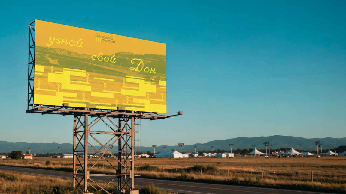
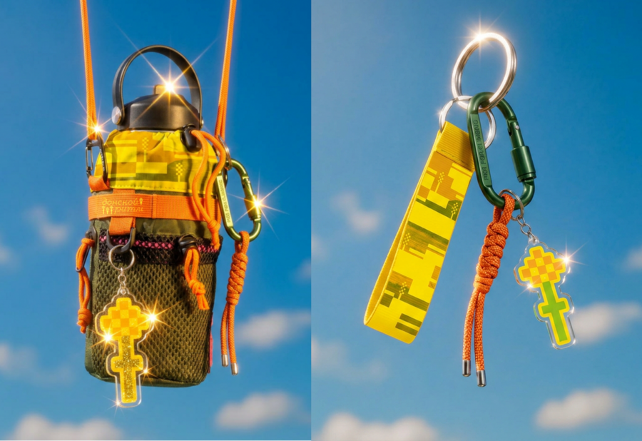
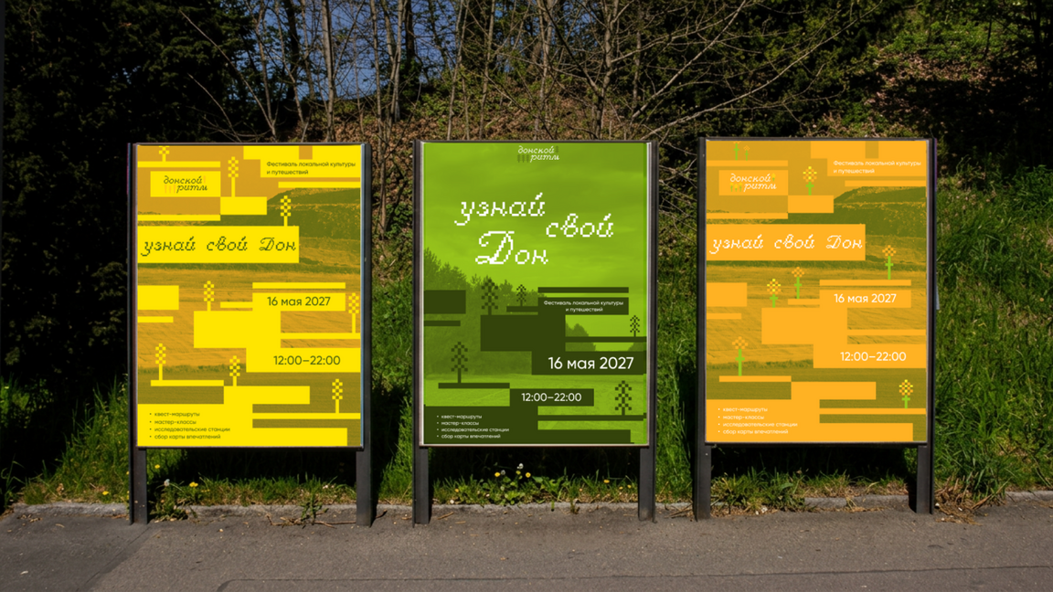
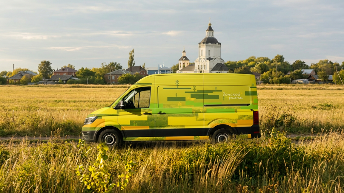
«Донской ритм» — туристическое агентство, организующее путешествия по Ростовской области. Проект знакомит с природой, культурой и самобытностью донского края через локальные маршруты, пейзажи и места, в которых раскрывается характер региона.
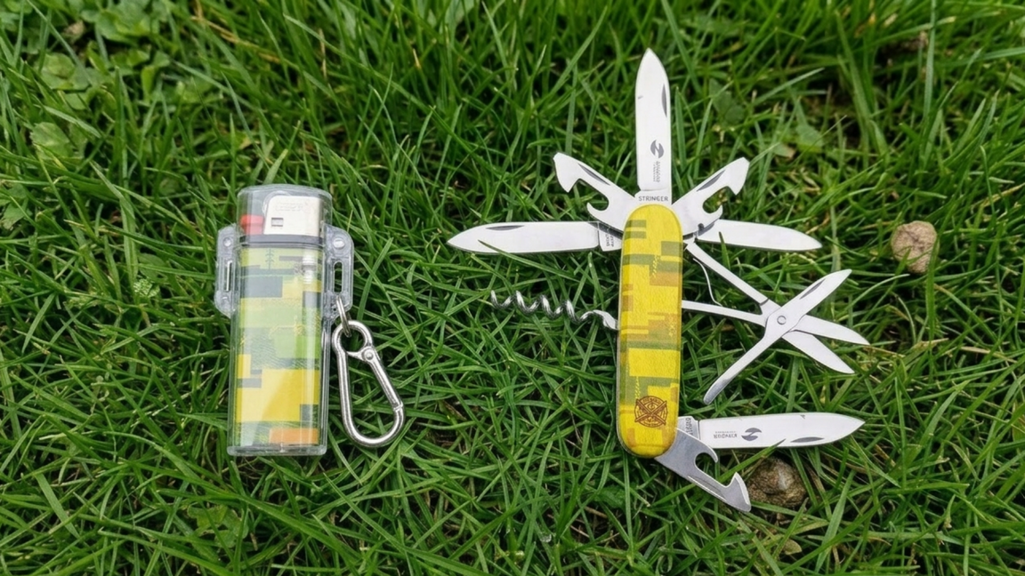
Стартап
Туристическое агентство «Донской ритм» ➡ бренд сувенирных товаров «Язык Дона»
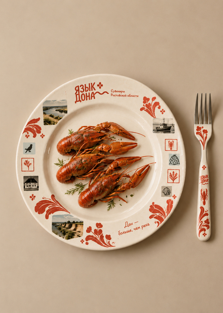
«Язык Дона» — бренд дизайнерских сувениров и предметов, вдохновлённых визуальной культурой Ростовской области. Мы переосмысляем региональные орнаменты, фотографии, ландшафты и детали повседневной жизни, превращая их в уникальные объекты: текстиль, керамику, постеры, открытки и коллекционные аксессуары. Это современный взгляд на родной край, который позволяет сохранить впечатления о месте и забрать с собой частичку донской культуры.
Логотип
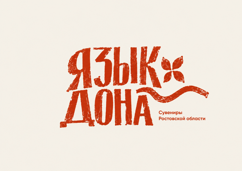
Промт:Expressive logo for the Russian souvenir brand «ЯЗЫК ДОНА». Bold condensed irregular Cyrillic typography, abstract four-petal folk ornament and a flowing river line. Rust-red ink, rough screen-print texture, warm ivory background. Contemporary experimental graphic design, strong composition. Logo only, no mockups, no extra text.Сделано с помощью ChatGPT
Цвета
Определено с помощью Adobe Color
Шрифты
Определено с помощью MyFonts
Фирменный стиль
Create a photorealistic 16:9 outdoor advertising mockup featuring a series of three large city posters displayed side by side in a black metal street billboard structure in Rostov-on-Don. Use the attached reference for the urban setting and composition: real city street, historic architecture, trees, pavement and warm late-afternoon sunlight.
All three posters must share the visual identity of «Язык Дона», a Russian regional souvenir brand. Use a vintage editorial collage aesthetic with warm cream textured paper, torn-edge photographs of the Don River and Rostov Oblast landscapes, traditional houses, local architecture, wildflowers, birds and botanical illustrations. Combine these with oversized expressive folk-floral ornaments inspired by Don Cossack decorative motifs, printed in distressed terracotta red.
Poster 1 headline: «ДОН — БОЛЬШЕ, ЧЕМ РЕКА». Poster 2 headline: «СВОИ ИСТОРИИ РЯДОМ». Poster 3 headline: «УЗОРЫ, В КОТОРЫХ ЖИВЁТ ДОН». Place the original «Язык Дона» logo and descriptor «Сувениры Ростовской области» on each poster.
Brand colors: BF300F, D98E7E, #BF1A0B. Use RUSLAN DISPLAY for all large headlines and Gilroy Bold for supporting text. Maintain consistent typography, collage composition and ornament style across the three designs, while giving each poster a unique photographic focus.
The posters must look physically installed outdoors, with realistic frames, natural shadows, slight paper texture and accurate perspective. Wide landscape 16:9 image, full billboard visible, documentary-style urban photography. No indoor gallery, no floating posters, no unrelated branding. Preserve the original logo design.
Create a photorealistic 16:9 mockup of a monumental double-sided corner rooftop billboard on a modern building in Rostov-on-Don, viewed from street level at golden hour. Preserve the architectural structure, dramatic perspective, blue sky and warm sunlight of the reference image.
Cover both visible faces of the billboard with a cohesive advertising design for the Russian regional souvenir brand «Язык Дона». The visual style is a contemporary vintage collage inspired by Rostov Oblast: warm cream textured paper, authentic photographs of the Don River, southern steppe, local architecture and traditional rural houses, combined with torn-paper edges, botanical illustrations, birds and oversized expressive folk-floral ornaments inspired by Don decorative art.
Use large terracotta-red ornamental flourishes as a central visual element, flowing across both billboard faces and connecting the compositions. Include the exact attached «Язык Дона» logo with the descriptor «Сувениры Ростовской области», preserving its original lettering, four-petal flower symbol and wavy river line.
Main headline on the left face: «РОСТОВСКАЯ ОБЛАСТЬ ГОВОРИТ СВОИМ УЗОРОМ». On the right face, include «ДОН — БОЛЬШЕ, ЧЕМ РЕКА». Use RUSLAN DISPLAY for all large Cyrillic headlines and Gilroy Bold for supporting text.
Brand palette: F2EEE9, BF300F, D96B52, D98E7E, #BF1A0B. Distressed screen-print texture, tactile paper grain, photographic collage, bold editorial composition, authentic regional atmosphere and premium outdoor advertising art direction.
Wide landscape 16:9 composition, entire corner billboard visible, realistic billboard materials, natural shadows and urban surroundings. No indoor setting, no floating graphics, no unrelated logos. Preserve the original brand logo and its proportions.
Create a photorealistic 16:9 outdoor advertising mockup of three tall street banners attached to ornate black lampposts along the Don River embankment in Rostov-on-Don. Show the river, bridge, city skyline, historic architecture, trees and warm golden-hour sunlight. All three banners must share the updated visual identity of the regional souvenir brand «Язык Дона».
New visual style: contemporary vintage editorial collage inspired by Rostov Oblast. Use authentic photographic imagery of the Don River, southern steppe, local architecture, traditional houses and wildflowers. Combine photographs with torn-paper edges, textured cream paper, small gingham fragments, botanical illustrations, birds and oversized expressive terracotta folk-floral ornaments inspired by Don decorative art. Let the ornaments flow organically across each banner and interact with the photographs.
Banner 1 headline: «УЗОР ВЫШЕЛ В ГОРОД».
Banner 2 headline: «РОДНОЕ ВЫХОДИТ НАРУЖУ».
Banner 3 headline: «У ГОРОДА СВОЙ УЗОР».
Place the exact attached «Язык Дона» logo and the descriptor «Сувениры Ростовской области» on all three banners. Preserve the original logo lettering, four-petal flower and wavy river symbol.
Typography: RUSLAN DISPLAY for all large headlines; Gilroy Bold for supporting text.
Color palette: cream F2EEE9, terracotta BF300F, coral D96B52, dusty pink D98E7E and deep red #BF1A0B.
Realistic printed fabric, subtle folds in the breeze, natural shadows, detailed urban photography and sophisticated editorial art direction. Keep all three banners fully visible, with consistent branding but different photographic compositions. Wide landscape 16:9 format. No indoor setting, no unrelated logos, no modern minimalist redesign, no generic tourist clip art.
Create a photorealistic 16:9 mockup of a pedestrian underpass in Rostov-on-Don, featuring a large continuous wall mural designed for the regional souvenir brand «Язык Дона». Show a long wall divided into three connected visual sections, with tiled floors, concrete ceilings, linear lights and daylight streaming in from the exit stairs. Two pedestrians walk toward the exit for scale.
Visual style: contemporary vintage editorial collage inspired by Rostov Oblast. Combine authentic photographs of the Don River, Rostov embankment, southern steppe, historic local architecture and traditional houses with torn-paper edges, textured cream paper, gingham fragments, botanical illustrations, birds and oversized expressive terracotta floral ornaments inspired by Don folk art. Let the floral motifs flow continuously across all three wall sections, intertwining with the photographic landscapes.
Section 1 headline: «УЗОР ВЫШЕЛ В ГОРОД».
Section 2 headline: «РОДНОЕ ВЫХОДИТ НАРУЖУ».
Section 3 headline: «У ГОРОДА СВОЙ УЗОР».
Place the exact attached «Язык Дона» logo and descriptor «Сувениры Ростовской области» within the mural, preserving the original lettering, four-petal flower and wavy river symbol.
Typography: RUSLAN DISPLAY for large headlines, Gilroy Bold for supporting text.
Color palette: cream F2EEE9, terracotta BF300F, coral D96B52, dusty pink D98E7E and deep red #BF1A0B.
Realistic printed-wall texture, tactile paper grain, distressed screen-print effects, sophisticated graphic composition and warm natural lighting. The mural must look physically applied to the architecture, following the wall perspective. Landscape 16:9, wide-angle architectural photography. No floating graphics, no unrelated logos, no generic tourist clip art, no minimalist redesign.
Create a premium photorealistic 16:9 top-down stationery mockup for the Russian souvenir brand «Язык Дона», arranged on a dark milky beige background (C8B8A5), warm and muted, not black or white. Include a branded letterhead, cream envelope, two business cards using my exact existing design, a souvenir catalog and a terracotta-red pencil. Use the original attached «Язык Дона» logo without altering its lettering, floral symbol, wavy line or descriptor. Apply large distressed folk-floral ornaments inspired by Rostov Oblast traditions across the catalog and envelope. Brand palette: F2EEE9, BF300F, D96B52, D98E7E, BF1A0B. Use RUSLAN DISPLAY for decorative headlines and Gilroy Bold for supporting text. Cream textured paper, terracotta-red printing, elegant editorial layout, soft natural studio lighting, realistic shadows, tactile materials, balanced composition with every item clearly visible. Landscape 16:9, cohesive contemporary regional identity, no black background, no extra objects.
Носители
Photorealistic 16:9 editorial product photograph of a young woman carrying a large cream canvas tote bag with terracotta-red handles, against a warm dark-milky beige studio background. The bag features the «Язык Дона» regional souvenir brand identity: the original red logo, oversized distressed folk-floral ornaments, vintage photographic collages of the Don River, Rostov Oblast landscapes, traditional Cossack houses and local architecture, delicate botanical illustrations, birds and red gingham details, printed on textured natural canvas in a tactile vintage screen-print style.
Use the brand palette F2EEE9, BF300F, D96B52, D98E7E and #BF1A0B, with RUSLAN DISPLAY-inspired bold decorative typography and Gilroy Bold supporting text; preserve the original logo proportions and Russian lettering, create a cohesive composition where the ornaments intertwine with the photographs, and use soft directional studio lighting, realistic fabric folds, subtle shadows, premium contemporary art direction, a slightly cropped model with the bag as the main focus, no additional props or unrelated branding.