I BRING IDEAS TO LIFE
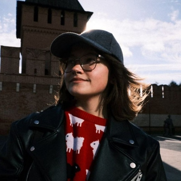
Alesya Gutkovskaya
Multidisciplinary Communication Designer
AI Design / Branding / Typography / Packaging DesignI combine creative thinking with a structured approach to develop visual solutions that work beyond the screen. I develop visual solutions from research and concept development to production and implementationMy experience includes working with printing companies, preparing files for production, collaborating with multidisciplinary teams, and contributing to exhibitions and events
Different skills — One creative approach
Branding & Packaging
Visual identities, brand systems, packaging, and merchandise
Typography & Editorial design
Typography, publications, books, and print materials
AI & Creative technologies
AI-assisted design, visual experimentation, and new creative workflows
Lettering & Type design
Custom lettering, typefaces, and expressive typography
Research first
Research
Target audience research, competitor analysis, and brand strategy
Problem Solving
Identifying challenges and exploring different solutions
Concept Development
Creating visual concepts, sketches, and design directions
Production
Preparing final designs and adapting them for real-world applications
Implementation
Bringing ideas into physical and digital environments
FROM CONCEPT TO REALITY
Case № 1
1) ContextTHE EDGE OF THE EARTH is a conceptual Arctic chocolate brand inspired by Teriberka, a coastal village in the Murmansk region. The collection includes three chocolate varieties — dark, milk, and white — featuring local ingredients such as cloudberries, reindeer lichen, and kelp2) The main goal
The challenge was to create a distinctive visual identity that differentiates the product from mass-market chocolate brands3) Solution
The packaging resembles a small display case containing a precious Arctic artifact. A transparent film reveals an untouched chocolate bar, while icy textures and cool colors evoke the atmosphere of the Far North. The name THE EDGE OF THE EARTH refers to Teriberka, where the land meets the Barents Sea
The project resulted in a cohesive chocolate packaging concept that communicates Arctic origins and creates a distinctive product identity. The design offers a potential way for a new brand to differentiate itself through regional storytelling and packaging
Hard Skills
Foreign languages — japanese and english
Typography, branding, and packaging
Prepress and print production
Adobe Programmes
Basic video editing
AI tools
Case № 2
1) ContextNavoloki is a small Russian town known for its textile factory and industrial heritage. Despite its manufacturing history, the town offers a quiet and peaceful atmosphere2) The main goal
The challenge was to transform the town’s unique character into a recognizable visual identity3) Solution
LOUD SILENCE — a contrast that defines the town. The concept combines two sides of Navoloki: the noise of textile production and the tranquility of everyday life. This contrast became the foundation of the city’s visual identity and merchandise
The project resulted in a cohesive city branding and merchandise concept that connects industrial heritage with peaceful living. The identity offers a way to communicate Navoloki’s distinctive character through memorable symbols and locally inspired products
Case № 3
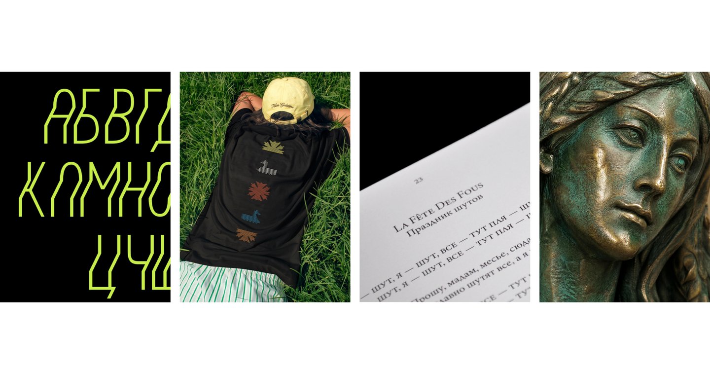
1) ContextSTWOPS is an experimental display typeface inspired by an upside-down accessibility sign spotted on a bus. Its stepped letterforms create an optical effect, making text appear to shift and move2) The main goal
The goal was to create a flexible typographic tool for branding, posters, editorial design, and creative communication3) Solution
The stepped structure of STWOPS creates an illusion of movement, transforming ordinary text into an expressive visual element. Its simple yet unconventional forms allow the typeface to be adapted to different creative applications
STWOPS is an experimental display typeface designed to attract attention and give visual communication a distinctive character. Its potential applications include expressive headlines, posters, branding, and editorial projects
Soft Skills
Time management and meeting deadlines
Responsibility and attention to detail
Cross-functional communication
Analytical and systematic thinking
Creative problem-solving
Case № 4
1) ContextNotre-Dame de Paris is a French-Canadian musical based on Victor Hugo’s novel The Hunchback of Notre-Dame. Unlike traditional musicals, its story is told entirely through songs, creating a continuous musical narrative2) The main goal
The challenge was to make the original lyrics accessible for reading, studying, and exploring the musical beyond the stage3) Solution
A book concept that combines expressive typography, clear text hierarchy, and editorial design to translate the musical’s atmosphere into a reading experience
A book design concept featuring the musical’s original lyrics, organized into a cohesive editorial layout. The publication is designed for both personal reading and educational use
DIFFERENT PROJECTS. DIFFERENT SOLUTIONS. ONE CREATIVE MINDSET
Every project is an opportunity to explore, experiment, and solve new challenges. I combine research, creative experimentation, and systematic thinking to develop distinctive visual solutions tailored to different audiences and business needs
Typography. Catalogue for the Anatomical Theatre exhibition
Identity. Merch for the Elizabethan Children’s Hospice
I have practical experience in:
Print production and prepress preparation; Turning digital designs into physical products; Collaborating with marketers, photographers, and other specialists;
Exhibition projects and event organization; Developing projects from initial concepts to final deliverables
The publication. A book about the placement and fastening of goods in wagons and containers
Merch. Calendar for 2026 for Formula 1 fans
Teamwork. Lettering and visual exploration