Communication strategy: TRANSIT brand
CONTENTS
1. General theoretical part 2. Presentation for a broad audience 3. Presentation for a professional audience 4. How we arrived at the strategy
GENERAL THEORETICAL PART

This project explores how familiar urban objects can be read in an entirely new way. Transportation infrastructure — road signs, transit elements, everyday city markers — usually exists on the periphery of our attention, perceived as purely functional and emotionally neutral. TRANSIT shifts this perception by treating these objects not as utilities, but as symbols within a broader communicative system. The goal is not simple aesthetic transformation, but a reconsideration of how meaning is constructed through form, material, scale, and context.
From the perspective of communication theory, meaning is never inherent — it emerges through interaction between symbols, cultural codes, and the viewer’s lived experience. A brand, in this sense, operates as a structured language: it sends messages, invites interpretation, and allows audiences to project their own associations. TRANSIT functions as such a system, using jewelry as a medium to translate the visual language of the city into intimate, wearable signs that feel both personal and collective.
In contemporary design practice, no choice is neutral. Shape references movement and direction, material speaks of durability and urban rhythm, and context reframes how an object is perceived and valued. By borrowing from the visual grammar of transportation and reworking it through jewelry, TRANSIT demonstrates how design can interrupt routine perception and reveal beauty in the overlooked. The project shows how theoretical approaches to communication can inform design decisions, making them intentional, meaningful, and culturally grounded rather than purely intuitive.
PRESENTATION FOR A BROAD AUDIENCE
The route is set…
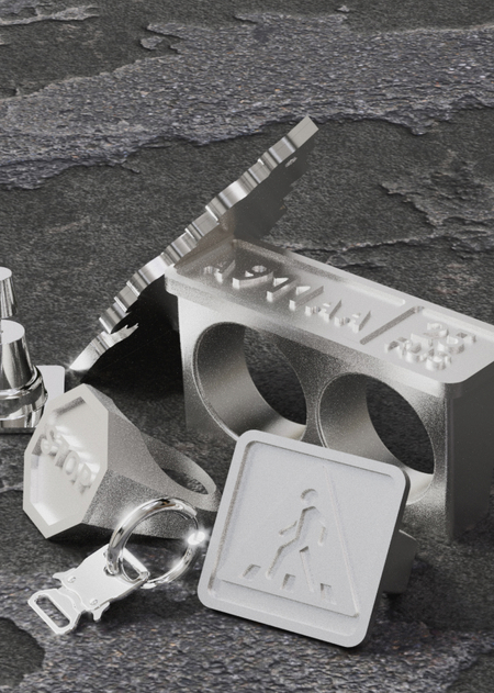
The concept behind the jewelry lies in reimagining the everyday transportation objects that constantly surround us. We take what usually fades into the background — road signs, transit details, urban artifacts — and turn them into wearable pieces.Earrings «belt». Transit. Arina Bezrukova’s jewelry 2025
TRANSIT is built on the values of freedom, independence, practicality, and bold self-expression. The values honesty in design and emotion, embracing the raw, imperfect beauty of the city as it truly is.
Ring «the tire». Transit. Arina Bezrukova’s jewelry 2025
Mission
The mission is to create jewelry that reminds people that beauty lives in the details of everyday life. By turning ordinary urban elements into meaningful objects, the brand invites wearers to slow down, notice their surroundings, and reconnect with the city on a more personal level.Earrings «cones». Transit. Arina Bezrukova’s jewelry 2025
Earrings «cones». Transit. Arina Bezrukova’s jewelry 2025
Rings «signs». Transit. Arina Bezrukova’s jewelry 2025
PRESENTATION FOR A PROFESSIONAL AUDIENCE
Brand Character
TRANSIT has an energetic, confident, and slightly rebellious character. It is playful but not superficial, ironic but not cynical. The brand speaks in a clear, approachable voice and feels familiar rather than distant or elitist. It is designed for people who are not afraid to stand out and who find joy in small visual accents that carry meaning.The visual world of the target audience
Target Audience
TRANSIT is designed for urban residents aged 18–35 who use style and accessories as a form of self-expression. They are drawn to experimentation in fashion, art, and design, and actively follow contemporary culture and the creative industries. Their purchasing decisions are often emotional and spontaneous rather than purely rational. They value irony, playfulness, and meaning in design, enjoying objects that spark associations or bring a subtle smile. These are people who embrace the city in all its chaos and rhythm, are not afraid to be noticed, and prefer individuality over conformity.Target Audience
Communication System
1. Outcome Engineering
Brand delivers social distinction (lifestyle friction) and also builds emotional connection via using objects that are common to the customer as a form.
2. Expectation Benchmarking
Brand is planning to monitor CL of audience via polls, comments, content behavior and also to collaborate with social media content creators.
3. Alternatives Awareness
Brand competes with substitute identity symbols, not only jewelry brands.
Communication Channels
Provocative descriptions, dynamic media content and bright framing (packaging, background) act as communication channels that amplify the interpretation of rebelliousness and energy.
Essence
At its core, TRANSIT is jewelry for those who move against the flow. It is about motion — not only physical movement through the city, but also inner movement toward new ideas, experiences, and perspectives. The brand exists at the intersection of everyday routine and personal discovery, transforming the mundane into something expressive and alive.Problem
Modern urban life moves at an overwhelming pace. People rush from one point to another, surrounded by endless content and idealized images, often losing the ability to notice and appreciate the world around them. Everyday objects become invisible, and routine replaces curiosity.Solution
TRANSIT responds by shifting attention back to the ordinary. By reinterpreting familiar transport symbols and urban artifacts as jewelry, the brand shows that inspiration does not require escape or perfection — it already exists in the city we live in. TRANSIT offers a more human, honest visual language that restores emotional connection, invites reflection, and turns daily movement into a meaningful experience.BRAND STRATEGY
The communication strategy for TRANSIT was built by relying on interpretive communication theory, especially the semiotic and socio-cultural traditions described in the course materials.
These approaches view communication as a symbolic and context-dependent process, in which meaning is not fixed but emerges through interpretation. This perspective directly aligns with the goal of the brand: creating jewelry that reminds people of beauty in the everyday life and carries emotional symbolism rather than decorative only.
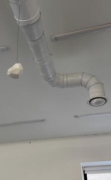
Pendant «car-freshner». Transit. Arina Bezrukova’s jewelry 2025
Semiotic Foundation
Each piece is a transposed sign. Its primary, public meaning (a stop, a direction, a crosswalk) is deliberately invoked and then subverted, creating a space for private, personal interpretation. The wearer completes the circuit of meaning, transforming a universal symbol into an intimate talisman.Sociocultural Context
TRANSIT responds to the desire for narrative-driven identity in an age of conceptual consumption. It rejects ostentatious luxury in favor of intellectual and emotional resonance, positioning jewelry as a tool for self-definition. It is for those who see their personal journey reflected in the functional grammar of the urban landscape.The socio-cultural shows how meaning is shaped within cultural communities and social practices, guiding TRANSIT to position its jewelry as a cultural dialogue between the brand and the viewer’s life experience. It should be noted that the brand evokes a strong emotional connection in the potential buyer not only through the use of familiar symbols, as mentioned above, but also through its strong character, exuding energy, bravery, and a challenge to the world.
Systemic Approach
The strategy ensures a coherent translation of theory across all touchpoints:Visual:
Documentary-style clarity meets displaced context. Clean, graphic photography juxtaposes the precise object against skin and raw urban textures.Narrative:
Verbal language is direct and evocative, using original functional names (Stop, Vector) paired with open-ended, personal prompts. Stories focus on individual meaning-making.Product & Experience
Design maintains formal integrity to the source object, emphasizing weight and tactility. Unboxing feels like uncovering an architectural artifact or a personal map.TRANSIT positions itself as an integral semiotic ecosystem, where decoration is a portable sign borrowed from the language of the city. According to communication theory, each object is a public symbol recoded into a personal narrative. Its meaning is fixed in the form, but it is revealed in the sock, linking the collective urban code with the individual biography.
Using a strict visual language of borrowed forms (signage, signage, markings) and industrial materials, TRANSIT creates signs for the concepts of path, boundary, and choice. This visual rhetoric convinces through recognition and appropriation, evoking intellectual resonance and a sense of personal connection to the space.
This theoretical framework forms a consistent strategy. For a wide audience, TRANSIT offers the individual charm of urban DNA — tools for conscious self-identification. For the professional community, the brand serves as an example of how design can act as an intermediary between the environment and humans, turning the utilitarian into the emotional.
Ultimately, TRANSIT successfully embodies the urban experience. It is a self—referential system in which the theory of the sign and the practice of wearing clothes merge together, turning a faceless infrastructure into a part of personal history, and an everyday urban route into a tangible reminder of one’s own path.
CONCLUSION
The course’s systemic view of communication helped structure how meaning travels through channels such as visuals, narratives, material choices, and presentation formats.
By integrating these theories into practice, the strategy frames TRANSIT as a communicative medium where designer and audience co-create meaning through symbols, context, personal interpretation and rebellious character that brand shows.
Course «Communication Theory: Bridging Academia and Practice»
Designing Brand Identity: An Essential Guide for the Whole Branding Team. URL: https://www.wiley.com/en-us/Designing+Brand+Identity-p-9781118980828.
Fashion Brands. Mark Tungate. — Bloomsbury Publishing, 2008. URL: https://www.bloomsbury.com/uk/fashion-brands-9781859738059/.
URL: https://hsedesign.ru/project/transit-f294bf0dd890464f81f4dbd627f9cb77 (дата обращения 14.12.2025)
